Visualizing England and Wales House Prices
- Ivan Lai
- Sep 30, 2020
- 2 min read
Updated: Oct 15, 2020
A Plotly web app showing average house prices by postcode sector.

"UK house prices soar to record high despite Covid crisis," proclaimed the Guardian headlines in the first week of September 2020. Against all odds, the direction of house price seems to be one of the few constants in this turbulent world of uncertainties.
But, is it really?
Economists have explanations for past data, but as always, the real interest lies in the forecast. A good friend of mine recently asked me about property prices in London, and to help him with the quest, I built a plotly web app to visualize the house price data which you can access here.
Data
The house price data comes from the HM Land Registry, covering transactions from the beginning of 1995. Property types come in 5 categories: Flats/Maisonettes; Terraced; Semi-Detached; Detached and Other. Type Other is filtered out from the data, as the price can be very low (under £1,000, and I am not sure what it is); or over £100 million for a multi-storey building, which would totally distort the average residential pricing.
Paddington or Kilburn
Just after I finished the app, my friend called again and told me he had shortlisted two properties - one in Kilburn, the other in Paddington. Clicking on the map part of the app, we have the following price-trends in the areas:
Paddington:

Kilburn:
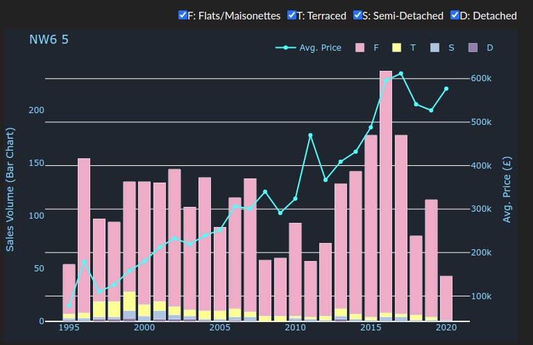
Flats are the main property type sold in both areas. Although the average price in Paddington more than doubled from 2019 to 2020, the sales volume dropped significantly compared to the previous year. As expected, the lockdown has slowed the activity of the housing market to a sluggish crawl. Kilburn also saw a dip in sales volume like the rest of the country, but it's still a touch below the peak price in 2017.
My advice? I do not have a good track record when it comes to house price prediction. Given the market's overall upward trend in the past 25 years, with hindsight, my stubbornness in waiting for "the right time" to buy our home never ceases to annoy my wife and amuse myself in equal measures. So I just sent my friend the two screen shots - and my app - for him to reach his own conclusion.
One caveat about the raw data was that property size was not accounted for. It is possible that the reality behind the figures is more complex - I suspect the recent jump in Paddington's house prices was in part due to the completion of a new luxury complex. Although the app has its limitations, it is a useful tool for prospective buyers making data-driven decisions.
What is your take on the market?
Comments